 |
welcome, guest |
Most Popular Art") ") ") ") ") |
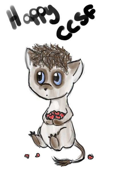 |
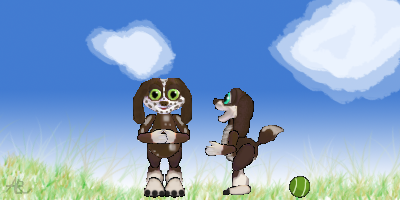
Magpie-angel says: "Just an art submission.  " "But it's a very cute one! Created by Magpie-angel for CCSF 2014. |
||
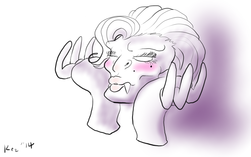 |
My entry for the CCSF 2014 Grendel Beauty Contest Originally, this entry was colored but when I erased the base colors to redo the whole thing, the shading and lighting stayed and I decided I liked the "parfum ad" look. Based on a Boney Grendel named Obese Bomb from my early blogging days. |
||
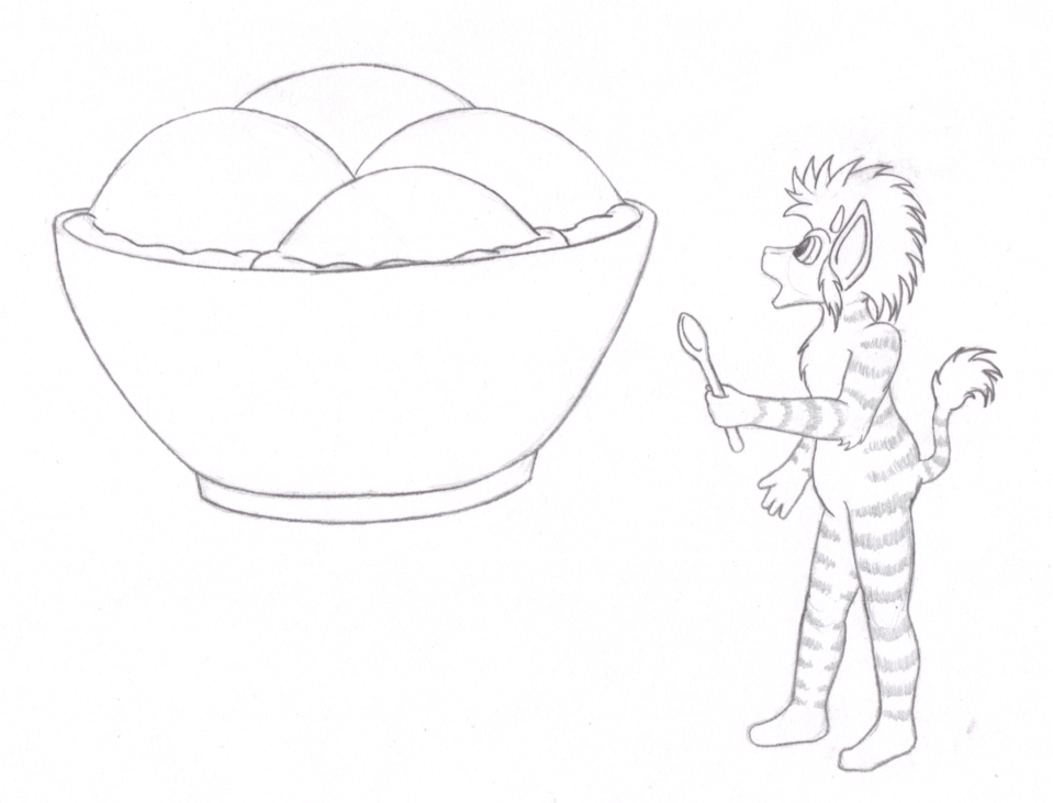 |
Mea says: "While the site was having troubles, someone had mentioned that Rascii & everyone who was helping to get the site back up & running properly deserved a big bowl of ice cream. How could I resist drawing a giant bowl of ice cream for them?" Submitted as a coloring page by Mea for CCSF 2014! |
||
 |
I don't think this is far-fetched at all. |
||
 |
I was just playing around with photoshop and thought I'd share the results with you. |
||
 |
Doneh, my favorite Norn. He was ALWAYS angry to the point where he couldn't eat and would only sleep after slamming down three Calm Balms (bringing him to the Norn Terrarium seemed to help though, which I find adorable. Nature therapy). I made the fatter version first, but he doesn't look like that in my mind. So the second version is more like how I envision him. Maybe he tends to stuff himself? His actual name was 'Donehogawa' because the Autonamer is crazy. He's mostly carnivorous, he likes to eat crunchy beetles. He picks fights and doesn't listen to people that easily, but deep down, he's nice and caring. He just doesn't like to admit it. He's a Hardman/Draconian/Yautja mix. |
||
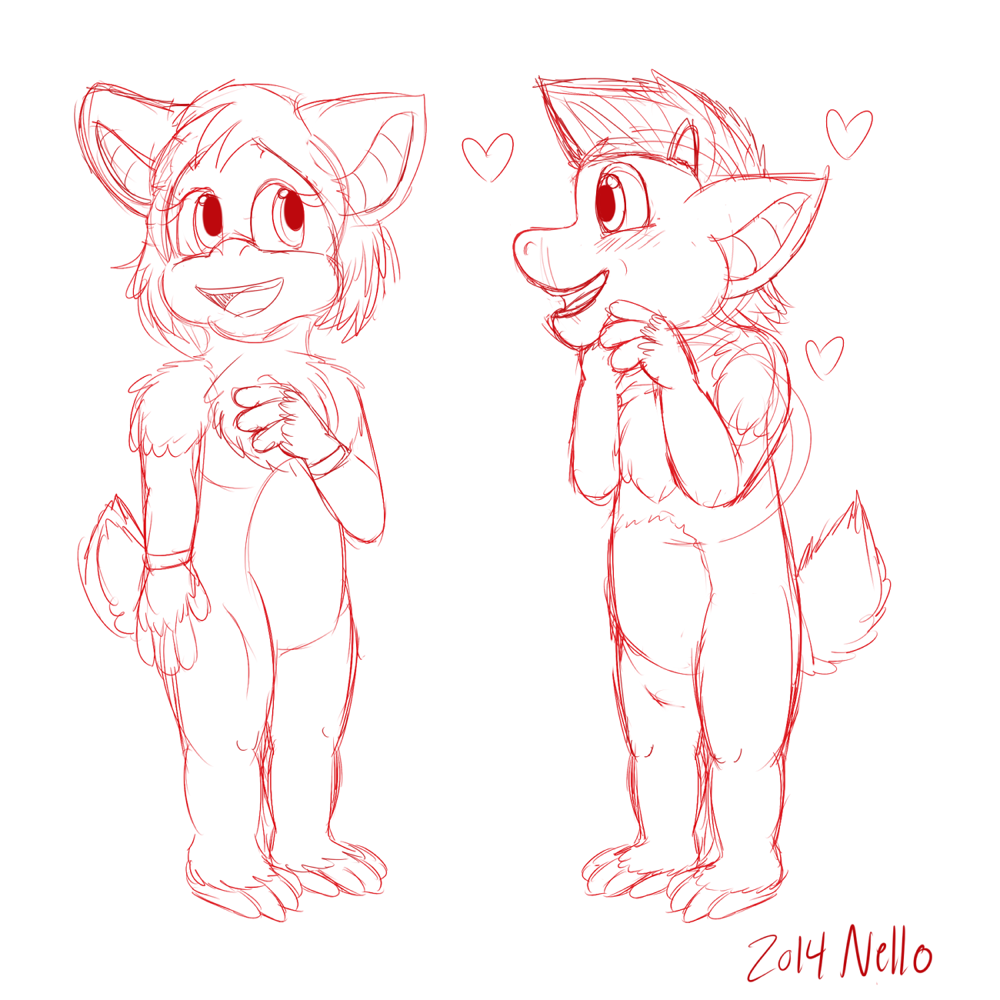 |
I just drew this sketch in my boredom. I tried to finish it, but I wasn't motivated enough to make the lines and then color it. But maybe sometime I will do a colored version or maybe I'll make a different drawing that looks nicer. It was a cute idea. Don't mind my messiness. |
||
 |
Here is another head. (I know these are very small, but I started with baby heads first) This may or may not be how they look in the end. I also am still experiencing problems with C2, so I can't promise that they will be in there in the end. But as of now, I am stuck because I'm about to begin the closed eyes and I don't know how to get the eyelids to look right with the facial tone they have. I may have to do some various editing to things if I can pick this back up. But for now, this is looking like what the concept appearance for a male should be. Who knows though. |
||
 |
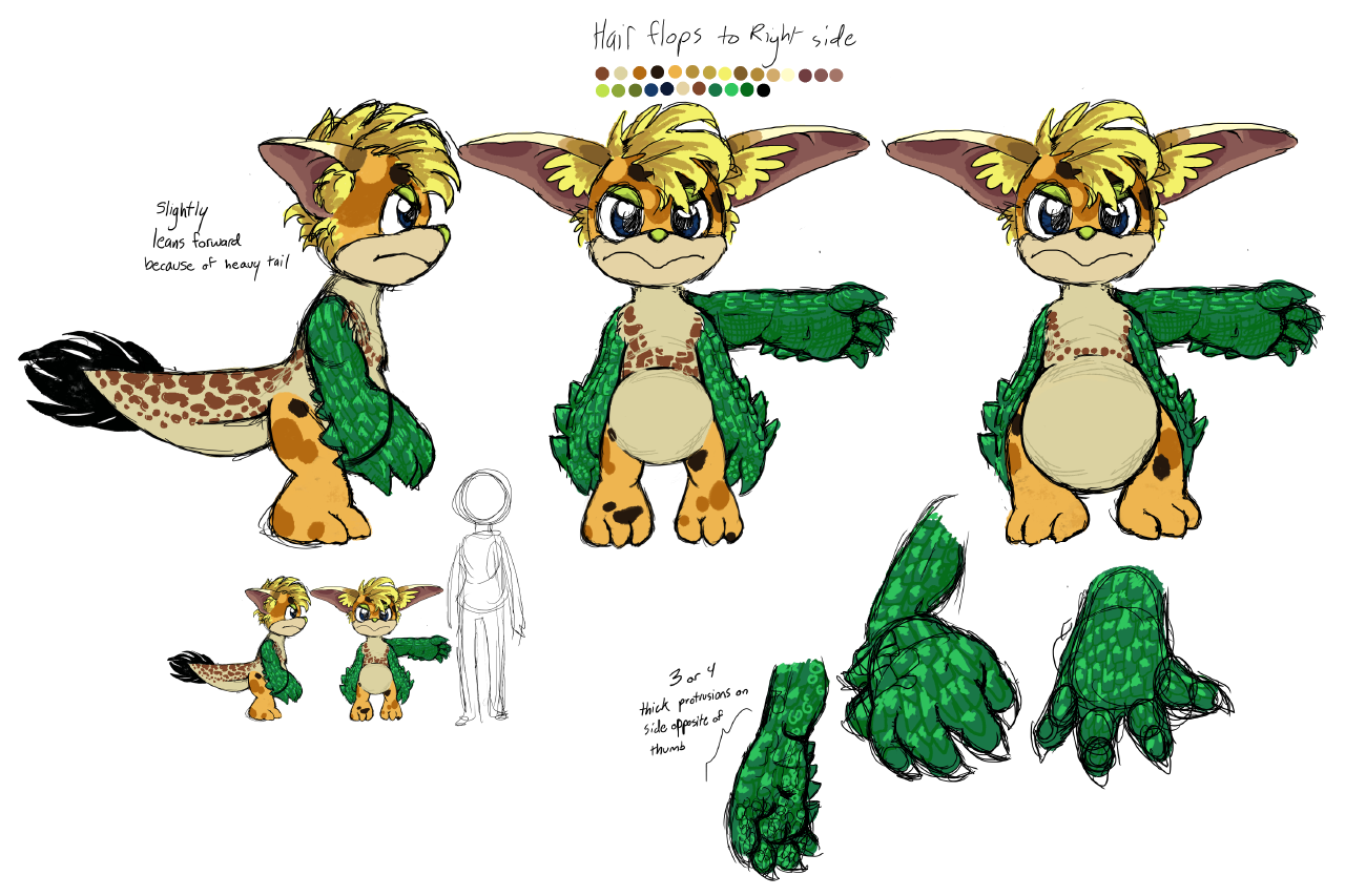
These are some prototype heads for a custom breed I'm working on. I'll go over the details: - Design may or may not be influenced by anime - More markings in old age About the gray-scale colors, I intend to make these a base for colored breeds. I've heard colors show better on gray. So, that's pretty much it right now. Anything I could change? Who else thinks the scared sprite looks more like it just got scarred for life? |
||
 |
Yes, I am at it again. I will see if I can make sprites for an updated version of the Cheri Norns, and this is just the first head that I am working on. I have no idea how long this is gonna take, but if I get help and/or pointers, this could either become a C2 or a DS breed. I can't run C2, so I would need assistance either way with that. I may be able to run DS on a virtual machine, but C2 refuses to work in my Windows 2000 virtual machine. But to make it into a DS breed would require a lot of help, that I would need to ask other breed developers for. I chose C2 sprites over the originals to see if there would be a way to make a newer version of the C1 breed, which I may also update eventually if I ever get time. ") This is just a little taste of my idea. We will see where this goes. This is just a little taste of my idea. We will see where this goes. |
||
 |
I read of the difficulties to draw smooth lines on favorite place icons, so I gave it a try with the recently uploaded favourite place icon. I didn't try to trace the lines of the symbol with max. accuracy because I wanted it to be a quick test so the fish does seem a bit... Deformed. But I think the lines look smoother all in all. I could make the fish look better if I invested more time into it.I'll write on the forum how I did it. |
||
 |
My latest attempt at making a favorite place icon. I don't think it turned out too bad considering my newbishness and the fact that I used GIMP, but criticism is accepted. |
||
 |
5/13! |
||
 |
I tried to make a 'How To' video alongside this, but it turned out the frame rate was far too low so the instructions look like eldritch gibberish! I'll have to do another one with one of the other heads. Oh well, live and learn! |
||
 |
3/13! |
| downloads cobs adoptions creaturelink metarooms breeds gallery art wallpaper screenshots graphics promos sprites |
dev hack shack script reservations dev resources active projects dev forum community links advice chat polls resources |
creatchi forum bookmarks general news help development strangeo survivor |
mycaves log in register lost pw |
0 online |
| creatures caves is your #1 resource for the creatures artificial life game series: creatures, creatures 2, creatures 3, docking station, and the upcoming creatures family. contact help privacy policy terms & conditions rules donate wiki |
||||