 |
welcome, guest |
| Development Forum | ||||
 |
| |||
Kule |
New thread for a specific issue I need opinions on. I'm currently in the polishing stage with my breed and originally I created the sprites as anti-aliased. This smooths out the edges but also has the side effect of turning alpha pixels dark and giving a sort of cell shaded outline look. Anti-aliased sprites aren't all bad and in my opinion it helps define the norns against the background and they pop out a bit more. Where it become a slight problem though is with cross breeding since the original creature labs breeds have hard pixel edges and blend in with the background better. I'm umming and ahhing to myself with which to go for as neither aliased or anti-aliased are bad, they're just slightly better or worse at different things. anti-aliased = better defined aliased = better cross breed results - closer to look of original breeds I'm personally starting to lean closer to redoing the sprites as aliased but before starting the work I would like a consensus from fresh eyes please!  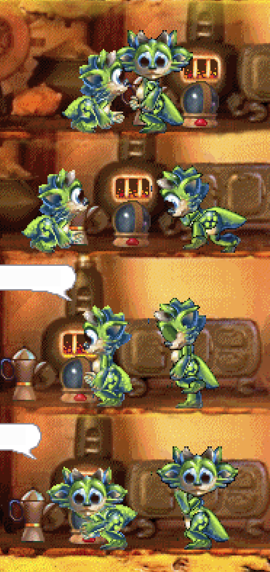 |
|||
Intyalle |
Personally, I tend to be inclined to aliased. I'm not fond of the black border. That said, I can see why you'd want it with those little guys, particularly around the thigh pattern. Unless that's a gender difference? They look cute, though ") Also known as bab_5_freak from the old Gameware forums. |
|||
Malkin Manager |
This would be clearer to see if another baby norn of the official breeds was nearby - what kind of graphics rendering do they do? My TCR Norns |
|||
Kule |
Yeah realised I should have included a default breed for comparison. Screenshots are actually a pretty poor way of presenting the difference. If anyone is interested and has C1 installed I can upload my test files. My feelings currently is anti-aliased would be a better option if I was dictating the games style. But as I'm not and it's a retro game, the aliased sprites mesh better. I'm guessing at the time when the artist made the original sprites anti aliasing wasn't possible but I don't know. |
|||
Lurhstaap |
The early/mid-90s are a time when if antialiasing was available at all, it was a much bigger task than it is now, IIRC. TBH though I don't see a big enough difference that I think it really matters much. Conclude with killer catchphrase. (Lurhstaap) "This is not knowledge - this is information!" New Model Army, "Courage" |
|||
Norngirl |
I think it would be easier to tell apart if non antialias and the one with antialias had same pose for easy comperation. What I can see,the body,arms,legs look good without the blacks around it - the head look both good,but if you want to keep the antialias,you only need to clean away just a few blacks and it will be good (if you ask me). I just wonder: Why is one tail longer than the other Norn males ? |
|||
Prodigal Sock Ghosthande |
Dang, they're coming along so well!  I think the anti-aliasing is helpful, because it adds a bit of shadow to some parts of the body, eg. under the chin... it adds some nice definition that makes the little guy easier to see. Maybe try blending the two together? If you set the anti-aliased set to (say) 50% opacity, you'll have darker edges, but not actual black. Some of the official C1 breeds do have pretty dark areas--I mean just look at the Purple Mountain Norns, even some of the tan areas on them (like their heels) have dark purple borders. So I don't think the added definition would make them stand out in a bad way.  |
|||
Kule |
Lurhstaap wrote: Thanks for the 90's trivia. I remember reading one of Steve Grand's diary entries and he was having a good moan about the sprite artists taking far too long.. I'm sure they had a blast using 90's imaging software. Norngirl wrote: Because I was being lazy and didn't swap out an old sprite. The norn with the larger tail is using an older body sprite which I do like the design of but when you take into account the other ages it doesn't flow correctly. It goes from long and pointy as a baby to smaller and rounder as a child so I decided to remake it chubby and shorter. Ghosthande wrote: Great idea about blending them! Feeling a bit shocked with myself for not thinking of that! I don't know how to manipulate anti-aliasing when going from RGB to the 256 indexed colours so I've just taken both aliased and anti-aliased and used a layer mask to blend anti-aliased so it's only around the shadowed area. Just tested with the head so far but it seems to give a decent look and avoids the 'cell shading' of full anti-aliasing. Banana norn is using the blended head sprite  I've also finally settled on a name. I had a few floating about but I'm going with 'Restoral Norns'. |
|||
Linda |
Oh my, these look gorgeous! I think I would prefer the aliased version, simply because it blends more smoothly with the background and with other breeds. ^u^ |
|||
Lurhstaap |
They really are very attractive. Enough to tempt me into actually cracking open the real C1 instead of running C1toDS. What's the concept? They remind me of mantises a little bit. Conclude with killer catchphrase. (Lurhstaap) "This is not knowledge - this is information!" New Model Army, "Courage" |
|||
Kule |
Lurhstaap wrote: I don't want to go too deep into the concept as I'm hoping to make some surprises with genetics but basically they're biomass vessels that absorb energy as they grow and release it when they die. It will make more sense when people see the senile age in game. I'm also hopefully going to port a higher quality version to C3/DS. I don't know what the colour limitations are but all the sprites have been made at 600dpi so the quality is pretty clean. I think it should translate ok but might need a few shading adjustments to match the different art style. I haven't looked into it yet to be honest. |
|||
Lurhstaap |
Ah, cool! A high-concept breed and everything! I'm very much looking forward to it. Conclude with killer catchphrase. (Lurhstaap) "This is not knowledge - this is information!" New Model Army, "Courage" |
|||
ham5ter |
+1 for aliased moep! |
|||
Patient Pirate ylukyun Manager |
I think the aliased version looks much better, even on its own. The crossbreeding issue seals the deal for me. Definitely aliased. |
|||
Tea Queen Laura Administrator |
Another point for the aliased camp - due to the crossbreeding issue, like ylukyun mentioned, and also just because I think the aliased sprites do look better without that darker outline, personally. Both look beautiful though, nice and unique. |
|||
NornBabbles |
+1 aliased : ) |
|||
Mioonktoo |
Another rock for the aliased pile. From the depths of Deep Lurkspace I emerge... And suddenly can't remember what it is I came up for. |
|||
Uzag |
These fellows looks amazing, they're very pretty, of high-quality and fits in perfectly. Fun concept too, they sure has a unique look! I think favor the aliased version. I see the issue of it being less defined but I think it's worth it as it will blend in better with the rest of the game's sprites. Nevertheless, the diffrence isn't massive and they'd be great which ever you choose to go with. Ghosthande's suggestion of doing a balanced blend is an option too. |
|||
Kule |
I have an update but first I want to say thank you to everyone that provided feedback, it's helped a lot and I've come to what I think is a good solution. I've previously attempted to write this (multiple times) and ended up rambling so I'm going to try and keep it to the point this time. I will be taking a break from working on these, not by choice but because a lot has changed in the ten months since I began this endeavour. In a sudden shift in my life I have recently bought a property and will be working on fixing it up for at least the next month before my apartment contract expires. The restoral norns are very dear to my heart and they will be finished but for now I have to go for awhile. I hope when I return it will be with new life for this amazing series of games. Have a great summer everyone! See you soon |
|||
Malkin Manager |
Congratulations on your new place! Good luck with the work ahead. My TCR Norns |
|||
MuppetBoy |
I hope this project is still going, these norns are intriguing! My main feedback is to increase the contrast on them, they look a little washed out. I agree with the Intyall, the black borders stand out and need cleaning up. Great work so far |
|||
Kule |
MuppetBoy wrote: Funny you should bump the thread as I've been planning to finish the breed. It's been around a year since I worked on the project and sadly real life got in the way but now things have settled down to the point that I have some free time to do my own stuff. females were already 100% finished, male baby was also finished so it's just young, adult and senior stages that I have left to convert into sprites. I'm not sure what you mean about them looking washed out. The original files were made at 600dpi and then converted to the indexed colours that the creatures 1 engine uses. I'm not sure there's much else I can do. Here's an example of how I made my sprites. High quality images, kinda scruffy because a lot of detail is lost when downsizing anyway.  sprite:  My main priority is to just get the breed done then I'll see how things go from there. |
|||
Fuzzy Dragonhat Pilla |
Ahh the image is so pretty! I really like the way you draw them. They look so adorable! As for the washed-out look, I think it's because there are mostly pastel colors being used. By playing with the levels and turning up the contrast and color intensity, the pastelness disappears a little. Personally I don't mind them being soft-y though, they're such pretty cute little creatures! I hope you don't mind that I took the liberty to make a really quick mockup of what might be meant by more contrast. I probably overdid it way too much  (sprite is artifically resized to 40x40 with the IMG tag, not an actual sprite attempt.) Actually, personally I don't really think they're washed out. Maybe a bit cloudy around the eyes - nose border since the colors there are quite alike. Aaah, the colors. They're so pretty. Please keep on going, they're awesome. <3 Visit my Creatures blog/website - Pilla's DS Agents Join us on Discord - Caos Coding Cave Visit/contribute to the Creatures Wiki |
|||
Kule |
Ok, that helps me see what was meant by washed out. The main reason they look washed out I guess is because I was sticking closely to the 256 colours that C1 uses. It was my first time making anything substantial for C1 so I didn't want to take many chances, it's also easier that what I'm looking at in photoshop is almost 1:1 to the game. I also played around for a very long time when it came to boosting definition of the various detailed elements, such as the face spikes, nose, ears, etc. It basically came down to infinite adjustments since the smallest change could drastically alter the look once the image is downscaled to sprite form. After awhile I just had to move on and avoid getting hung up on perfectionism. I'm pretty happy overall but there's definitely a lot I'd change if given the time and patience. At this point my goal is just to get them finished using the files I already prepared. After that I can make adjustments and update them. |
|||
Rinny |
Lovely * |
|||
Kule |
Just an update because the thread was bumped: The project is still being worked on as from around two weeks ago. Unfortunately I've been caught up with irl stuff over the last couple of years and I would have loved to have continued working on this but it just wasn't possible. Things have finally settled down a bit and so I'm making a conscious effort to finish this project. Currently I'm trying to relearn my workflow and I'm sorting out all the files and folders from when I first started and getting my head around everything. As part of this I completed the male youth stage while teaching myself the steps again. I can't dedicate a huge amount of time because of work but at weekends I'll try and get as much done as possible. It's important for myself to see this through to the end and I still have ambitions to do other modding projects with the creatures series. |
|||
Moe |
One way to [just about] "have your cake and eat it too" with anti-aliasing, is to use a different color background for starts. This works particularly well when the sprite in question is predominately one color and this would probably work well with your breed since it's mostly green. Instead of painting/rendering the original sprite on a black background, do it on a dark color from the pallet of your subject. In this case, a dark green would do nicely. How dark is up to you. Then when you go to remove that color and replace it with the necessary black, the aliased artifacts will still exist but they will simply be a darker shade of your chosen color, and much less jarring. How well this works will depend on the experience you have with the art tool you're using. If you're trying to "magic wand" your way to removing the background, it's going to get ugly real quick because the wand will start leaking into your subject. Instead, I'd suggest working with the alpha value of the painted layer and use contrast tools to shape the borders accordingly. The trick will be do make it a HARD edge, and simply move that edge inwards or outwards to include more or less pixels depending on your desired level of anti-aliasing. If you allow it to be a soft selection, it'll still blend with black and ruin the effect. If you try different color backgrounds and nothing seems to be working quite right, try a middle gray value. You'd be surprised how much aliasing you can hide with a simple gray. |
|||
Kule |
Thanks for the advice Moe. I didn't have any experience making sprites so planning for the black edges wasn't on my mind. Currently I've been focusing on the non AA versions but I'll do some testing and see what the results look like using your method. |
|||
MuppetBoy |
*bump* Here's hoping this breed will see the light of Albia ") |
|||
C1Breeder_Lunar |
yes please! ~Lunar |
|||
Kazooo |
Is this dead? |
|||
Peppery One Papriko |
Not to spoil the mood or anything, but according to their profile page, OP was last seen in mid 2020... Lets play plants! Photosynthesis... Photosynthesis... Photosynthesis... |
|||
ProphetSix |
how did you get the sprites to be aliased? can it be done in C3-DS? |
|||
| downloads cobs adoptions creaturelink metarooms breeds gallery art wallpaper screenshots graphics promos sprites |
dev hack shack script reservations dev resources active projects dev forum community links advice chat polls resources |
creatchi forum bookmarks general news help development strangeo survivor |
mycaves log in register lost pw |
1 online Papriko |
| creatures caves is your #1 resource for the creatures artificial life game series: creatures, creatures 2, creatures 3, docking station, and the upcoming creatures family. contact help privacy policy terms & conditions rules donate wiki |
||||